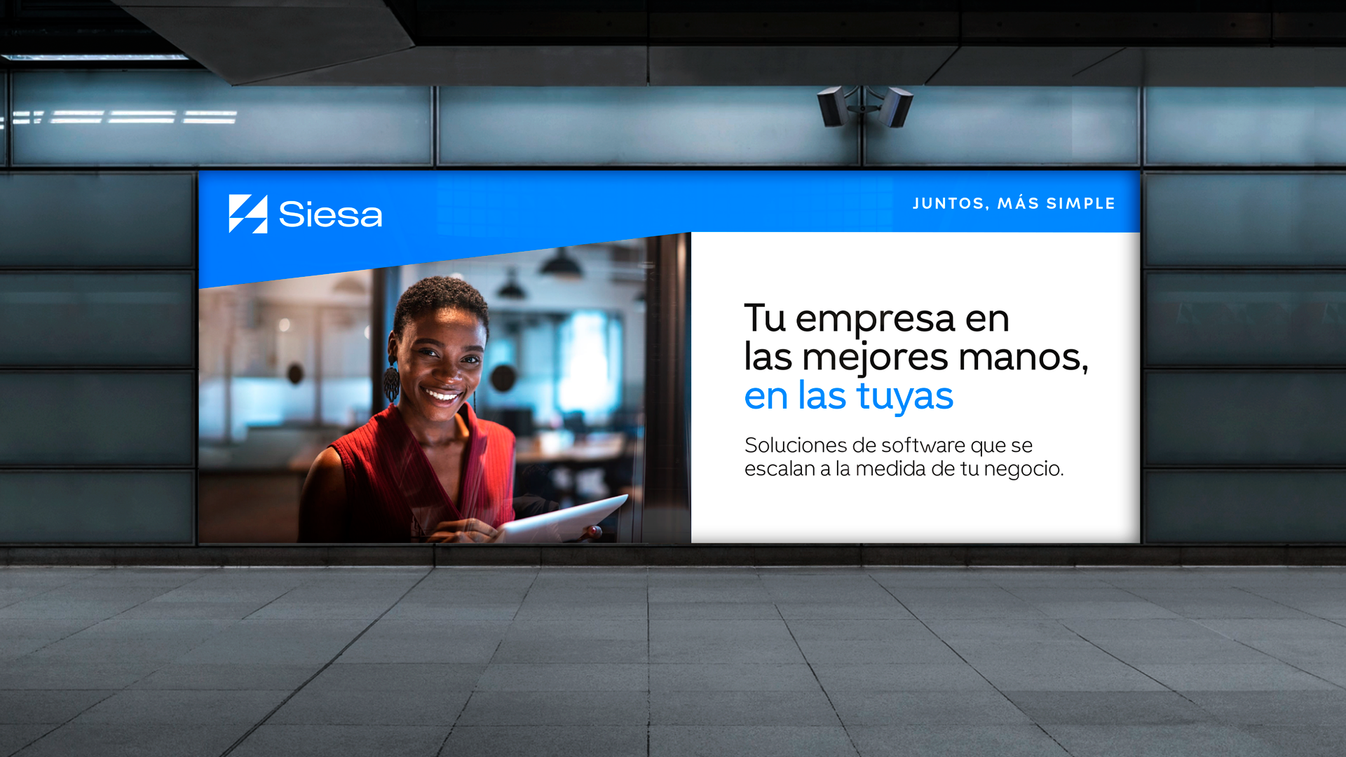
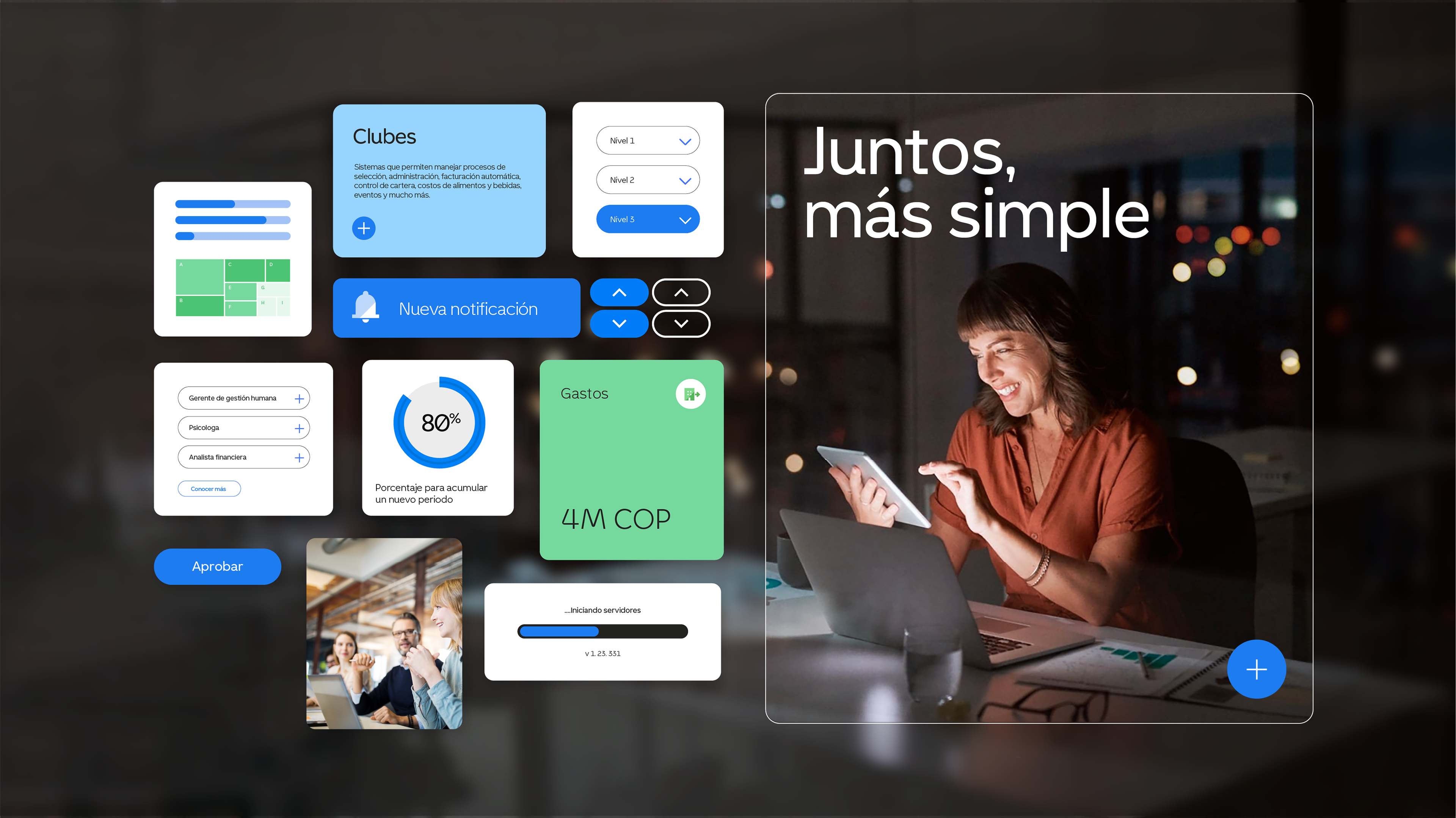
Siesa, simple together.
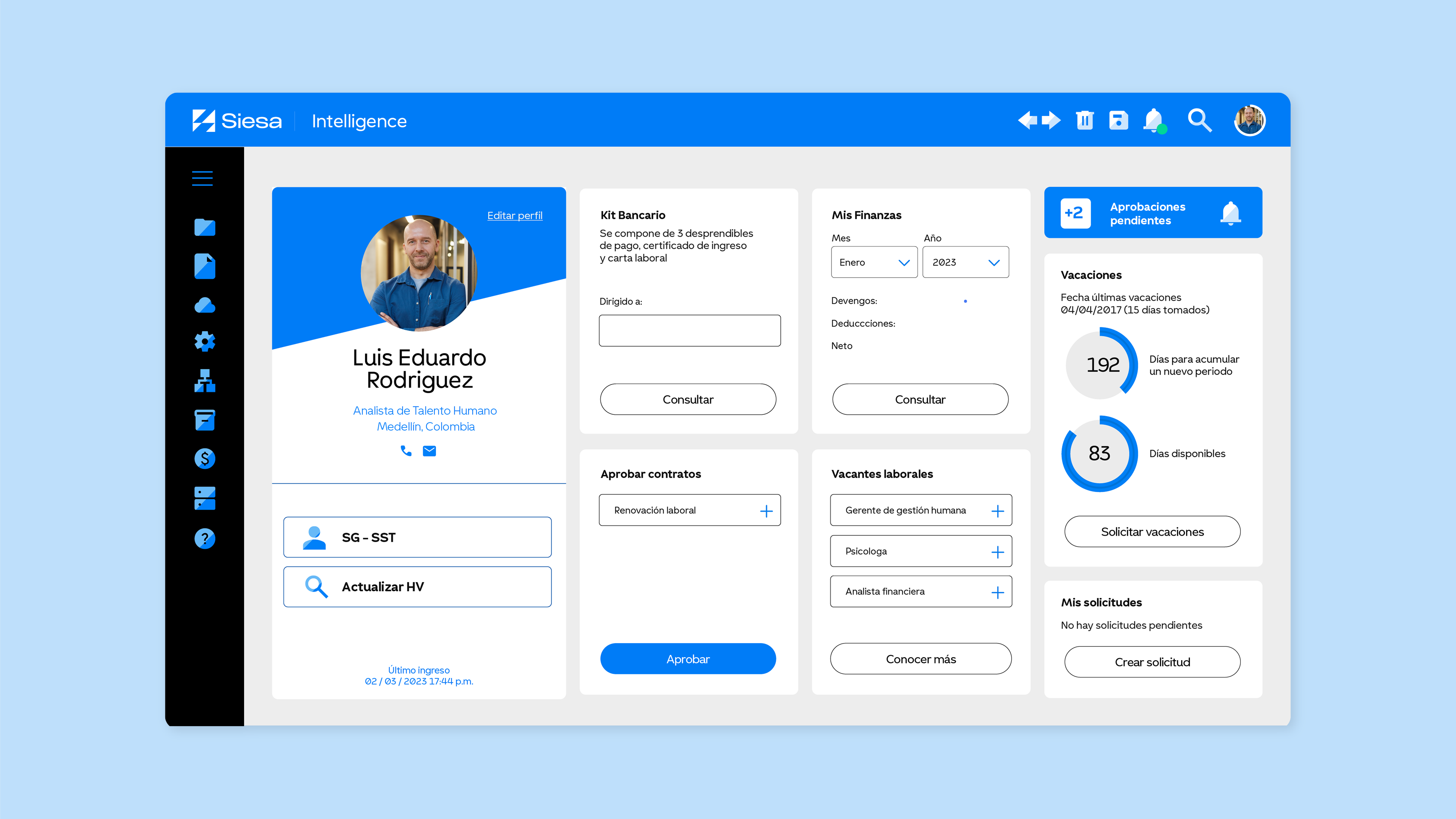
Siesa, a leading ERP provider with over 10,000 clients in Latin America, redefined its identity to drive global expansion. Aluzian developed a brand rooted in the concept of “Projection,” reflecting its ability to grow alongside its clients. The new symbol, an abstract “S,” represents scalability and connection, while a versatile visual system ensures consistency across all touchpoints.
The identity is complemented by a custom typeface that balances technological precision with approachability and an expanded color palette that enhances its digital presence. This evolution positions Siesa as a strategic partner for growing businesses, with a strong and adaptable brand ready for new markets.


Creative & Strategy Director Partner
SANTIAGO VALDERRAMA
Motion